Teal-toned digital illustration with the text “How Realistic CGI Can Cut Production Costs,” showing a computer screen with a realistic 3D-rendered male head, two professional cameras, a cameraman, and a coin with a dollar sign symbolizing cost savings.

How Realistic CGI Can Cut Production Costs

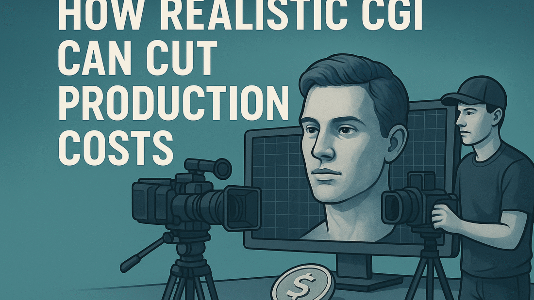
Creating high-quality visual content has always come with a price. Whether it’s film, advertising, or game design, the costs of building physical sets, hiring extras, or capturing the perfect scene can quickly climb. But there’s a modern solution that’s transforming how creators work — realistic CGI (Computer-Generated Imagery).

In this post, we’ll break down how CGI isn’t just about visual impact — it can also significantly reduce production costs when used wisely.


Traditionally, filming on-location or building custom sets is expensive. You need permits, materials, construction crews, lighting setups — the list goes on.

With realistic CGI, full environments can be created digitally. Think of cityscapes, fantasy worlds, or even simple interiors. These virtual sets can be reused, adjusted on the fly, and shot from any angle without additional setup.

Savings: No location fees, no physical build costs, no weather delays.


When you’re filming live, mistakes happen. A scene might need reshooting because of lighting issues, background noise, or missed cues. That costs time and money.

CGI gives you complete creative control over the environment and timing. Want to change the lighting or background after filming? It’s possible. You don’t need to bring everyone back for a reshoot.

Savings: Avoids costly re-filming and unexpected delays.


Every physical prop and costume adds to your budget. But in CGI, even complex items — like futuristic vehicles, monsters, or machinery — can be digitally created.

And they can look just as real as the physical thing if you invest in high-quality CGI. No need to rent equipment or craft items that only appear for a few seconds.

Savings: Cuts material costs and labor expenses.


Live productions require large teams: set designers, lighting techs, makeup artists, stunt coordinators, and so on. With CGI, much of the work shifts to post-production, handled by smaller, specialized teams.

A lean CGI-focused crew means fewer people on set, smaller budgets, and less logistical hassle.

Savings: Reduces payroll and overhead.


One of the biggest advantages of CGI? Once it’s made, it can be reused or scaled. Need that same 3D model of a dragon for multiple episodes or ad campaigns? No problem. Want to slightly tweak a location to fit a different story? You can do that — without rebuilding from scratch.

Savings: Long-term value from initial investment.


Not always — the upfront cost for high-end CGI can be significant. But the key is in how it’s used. When planned well, CGI can streamline production, prevent costly errors, and provide assets that last beyond one project.

For many productions, especially those that require visual complexity or flexibility, realistic CGI pays off in the long run.


CGI isn’t just a creative tool — it’s a budget-friendly strategy. By replacing physical elements with digital ones, reducing shoot time, and scaling production with reusable assets, CGI is helping creators produce more while spending less.

If you’re planning a project, it’s worth asking:
Could CGI save you money — and make your work look even better?

5 Industries Using 3D Animation to Drive Engagement

3D animation isn’t just for movies and video games anymore. Over the past decade, it has evolved into a powerful communication tool used by businesses across various industries to capture attention, explain complex ideas, and create memorable experiences.

In this article, we’ll explore five key industries that are successfully using 3D animation to boost engagement and stand out in a crowded digital world.


The healthcare industry often deals with complicated concepts that can be difficult for patients or stakeholders to understand. That’s where 3D animation shines.

  • Visualizing procedures and anatomy
  • Explaining how medications or treatments work
  • Training medical professionals through realistic simulations

Whether it’s an animated explainer about heart surgery or a 3D model of a new device, animation helps break down complexity with clarity and accuracy.


Static blueprints and drawings can only go so far. 3D animation allows architects, real estate agents, and developers to show what a project will actually look like—even before construction begins.

  • Virtual property tours for clients and investors
  • Walkthrough animations of building interiors
  • Concept visualization for design approvals

These animations add a “wow” factor and help clients connect emotionally with a space they haven’t even seen in real life.


When selling a product online, visual appeal is everything. 3D animation lets brands present products in dynamic, engaging ways that static photos can’t match.

  • Rotating 3D views of products
  • Exploded views to show internal components
  • Animated ads that highlight features and benefits

Especially for tech gadgets, fashion, furniture, and even beauty products, 3D animation creates a premium, interactive feel that drives conversions.


Students and learners engage more deeply when content is visual and interactive. 3D animation transforms traditional lessons into exciting experiences.

  • Bringing abstract concepts to life (like atoms or the solar system)
  • Demonstrating scientific processes or historical events
  • Gamifying learning experiences for kids and adults alike

3D animations help retain attention, increase understanding, and improve memory—making learning more effective and enjoyable.


In the fast-paced world of advertising, grabbing and holding attention is everything. 3D animation makes that possible with stunning visuals and emotional storytelling.

  • Brand characters and mascots in animated campaigns
  • Creative explainer videos that simplify messages
  • Short-form content for social media and mobile

Animated brand stories can be quirky, heartwarming, futuristic, or fantastical—whatever fits the brand. And when done well, they’re highly shareable.


3D animation is no longer limited to entertainment. It’s now a strategic asset for businesses across industries, helping them communicate better, market smarter, and connect more deeply with their audiences.

Whether you’re in tech, healthcare, education, or real estate—3D animation can elevate your message and drive real engagement.

The Difference Between CGI and VFX — And When to Use Each

In the world of modern filmmaking, the terms CGI and VFX are often used interchangeably—but they’re not the same thing. Understanding the difference between them can help you choose the right approach for your creative project, whether you’re making a short film, a children’s book trailer, or a high-end commercial.

Let’s break down what each term means, how they work, and when it’s best to use one over the other.


Visual Effects (VFX) refers to any process that involves altering or enhancing live-action footage after it’s been captured. This can include everything from removing wires or set elements to adding huge explosions, magical spells, or digital environments.

Think of VFX as the umbrella under which many digital techniques live—including CGI.

  • Replacing green screens with digital backgrounds
  • Adding smoke, fire, or weather effects in post-production
  • Creating entire crowd scenes using duplication
  • De-aging an actor’s face digitally

So, VFX includes many methods—some practical, some digital—that come together to shape the final look of a scene.


CGI, or Computer-Generated Imagery, is a subset of VFX. It specifically refers to images and animations that are created entirely by a computer, usually using 3D software.

While VFX enhances or manipulates existing footage, CGI creates visuals from scratch—whether it’s a dragon, a spaceship, or an entire city skyline.

  • A digitally created dinosaur in a jungle
  • 3D animated characters or creatures
  • Entire scenes or environments built in 3D software
  • Vehicles, architecture, or props that don’t exist in real life

In most modern productions, CGI and VFX work side-by-side. For example, if a superhero is flying through a city:

  • The city skyline might be CGI
  • The glowing energy trail could be VFX
  • And the actor might be filmed on a green screen that is later removed with VFX techniques

VFX is the process; CGI is often the content created for that process.


Use VFX when:

  • You’re working with live-action footage that needs enhancement
  • You want to fix or remove elements in post-production
  • You’re adding realistic effects like smoke, sparks, or lighting
  • You need to blend real-world and digital elements seamlessly

VFX is ideal for film, TV, YouTube videos, trailers, and even branded content.


Use CGI when:

  • You need to create something that doesn’t exist in real life
  • You’re designing animated characters, creatures, or vehicles
  • You want full control over the environment or action
  • You’re working on animation-heavy projects or virtual product demos

CGI is also perfect for children’s media, fantasy storytelling, game trailers, and explainer videos.


While CGI and VFX are closely connected, they serve different purposes. VFX is about altering or improving existing footage, while CGI is about creating new visual elements using digital tools.

Understanding when and how to use each one can elevate your storytelling, save time in production, and help you achieve exactly the look you’re going for—whether that’s realistic, whimsical, or totally out of this world.

Behind the Scenes of a VFX Project: From Idea to Screen

When we watch a movie filled with explosions, futuristic cities, or fantastical creatures, it’s easy to get lost in the magic and forget how it all came together. But behind every jaw-dropping visual effect lies a long, detailed process—full of creativity, collaboration, and technical expertise.

Let’s take a peek behind the curtain and walk through the real-world journey of a VFX project, from that very first spark of an idea all the way to the final frame that hits the screen.


Every VFX project starts with an idea. This could come from a director’s script, a storyboard, or even just a rough sketch.

In this early stage, VFX supervisors sit down with directors and producers to understand the creative vision. They ask questions like:

  • What is the scene trying to convey?
  • Should it feel realistic or stylized?
  • How can VFX support the story, not distract from it?

Mood boards, rough sketches, and references from other films or real-life footage often help shape the direction.


Previs is where the ideas start taking shape. Using basic 3D animation and camera moves, the VFX team creates rough versions of scenes to map out timing, movement, and composition.

This stage is crucial because it saves time and money later. Directors can “see” the scene before anything is filmed. That means fewer surprises (and costly fixes) in post-production.


VFX doesn’t work in isolation. During filming, VFX supervisors are often present on set, making sure everything lines up for smooth post-production.

They guide lighting setups, camera angles, green screen usage, and tracking markers. Every shot must be carefully planned so digital effects can be added seamlessly later.

Actors may even be reacting to things that aren’t there—like a monster or spaceship—so precise direction is key.


Once filming wraps, the footage is handed over to the VFX studio, and now the real transformation begins.

Here’s a breakdown of the major tasks:

  • Modeling: Artists build 3D versions of characters, environments, or objects.
  • Texturing & Shading: These add surface details—making things look metal, glass, skin, etc.
  • Rigging & Animation: If something needs to move, it has to be rigged like a skeleton, then animated frame by frame.
  • Simulation & Effects: Fire, smoke, water, hair, destruction—all simulated through physics engines.
  • Compositing: Finally, all the elements—real footage and digital effects—are combined and color-graded to match perfectly.

This process can take weeks or even months depending on the complexity of the scene.


No VFX shot is ever perfect on the first try. Directors and producers give rounds of feedback. Something might look “too fake,” or not match the tone of the film.

That’s normal—and part of the creative process. Some shots go through dozens of versions before they’re approved.


Once all shots are approved, the VFX team renders the final images in full quality and delivers them to the editor for final integration.

These frames are often incredibly detailed and high-resolution—sometimes taking hours to render just a few seconds of footage.


VFX may look like magic—but it’s really a mix of science, technology, and storytelling. From the first sketch to the final render, each step in the process is carefully crafted by teams of talented artists, animators, and technicians.

So the next time you see a spaceship take off, a superhero fly, or a dragon breathe fire—remember the dozens (or hundreds) of people who brought that vision to life, one frame at a time.

How 3D Animation Can Elevate Your Brand Storytelling

In today’s noisy digital world, brands fight for attention every second. Traditional content like static images or plain text doesn’t cut it anymore. If you want your message to actually stick—and more importantly, connect emotionally with your audience—you need to go beyond just telling your story. You need to show it.

That’s where 3D animation comes in.

More than just a visual trend, 3D animation is becoming a powerful storytelling tool for brands. It combines design, motion, sound, and emotion into a medium that people remember. But how exactly does it work? And why should you consider adding 3D to your branding strategy?

Let’s break it down.


3D animation is the process of creating three-dimensional moving visuals using computer software. In branding, this can mean:

  • A 3D product explainer
  • Animated logos or intros
  • Immersive brand stories
  • Social media campaigns with animated characters
  • Website hero sections that move and respond to users

Unlike 2D animation, which is flat, 3D brings depth, realism, and dimension—making your brand feel more lifelike and engaging.


Humans are visual creatures. Movement, depth, and light trigger curiosity. A well-crafted 3D animation pulls people in before they even realize it—making it perfect for high-scroll platforms like Instagram, TikTok, and YouTube.

When used right, animation can tell stories in a way that text or live action sometimes can’t. It can exaggerate emotion, highlight tiny details, and create experiences that feel magical or futuristic—exactly what today’s consumers want to feel.

Trying to explain how your tech product works? Or what your startup actually does? 3D animation can break it down visually and clearly in just seconds. Think of it as storytelling for the visually overloaded generation.


  • Nike often uses 3D motion to highlight design and function in product ads.
  • Apple uses subtle 3D in their keynote videos and product launches.
  • Headspace brings mental health to life with 3D characters that feel warm and approachable.
  • Coca-Cola uses 3D holiday campaigns to spark nostalgia and brand love.

Even smaller brands are using 3D now—especially in eCommerce, mobile apps, and animated logos.


  • Product reveal videos
  • Social media posts
  • Website banners and headers
  • TV ads or YouTube pre-rolls
  • Pitch decks or investor presentations
  • In-app onboarding screens

Basically—anywhere your brand shows up, 3D can help make the moment more memorable.


Not necessarily.

While Hollywood-level 3D can be costly, tools like Blender, Cinema 4D, and even Canva (for basic 3D mockups) are becoming more accessible. You can hire freelance 3D animators or use templates to start small. The key is to match your animation level with your brand’s voice, product, and budget.


3D animation isn’t just eye candy. It’s a strategic tool that can transform how people see—and remember—your brand. In a world where storytelling is everything, using 3D gives you the edge to stand out, be remembered, and connect more deeply with your audience.

Whether you’re launching a new product, building a brand identity, or trying to go viral—3D animation is a powerful way to bring your story to life.

From Story to Sales: Designing KDP-Ready Illustrations

Writing a children’s book is a major milestone—but if you want to self-publish on Amazon KDP, the story alone isn’t enough. Your book also needs eye-catching, professional illustrations that are KDP-ready—meaning they’re properly formatted, high-quality, and visually aligned with your story’s tone.

If you’re an author or illustrator aiming to turn your story into a sellable, self-published book, this post is for you. Let’s walk through what it takes to go from storytelling to sales—by designing illustrations that work for both children and Kindle Direct Publishing (KDP).


Amazon KDP is one of the most accessible platforms for self-publishing, but it comes with its own set of formatting rules and printing limitations. Illustrations that look great on your screen might not translate well into print—or worse, might get rejected during upload.

To avoid that, your artwork needs to be print-ready, properly sized, and visually effective on both digital and physical pages.


Before you or your illustrator begin drawing, you need to know the final book size. Popular trim sizes for children’s books include:

  • 8.5 x 8.5 inches (square)
  • 8 x 10 inches (portrait)
  • 6 x 9 inches (for early readers)

All illustrations should be created at 300 DPI (dots per inch) for print quality. Anything less can appear blurry or pixelated in the printed version.


If your illustrations go all the way to the edges of the page, they must include a bleed area—usually about 0.125 inches on all sides. This ensures there are no white edges after the book is trimmed.

Also, make sure no important parts of the image are within the trim or bleed zones, especially text or faces. Always keep key elements in the safe zone (usually at least 0.25 inches from the edge).


Children notice inconsistency quickly. Whether your book is hand-drawn or digital, your characters, settings, and color tones should stay consistent from the first page to the last.

Use a limited, well-balanced color palette to keep the visual flow smooth. Consistency builds trust with your young readers and gives your book a polished look.


Your illustrations shouldn’t just show the scene—they should add to the storytelling. Think about:

  • Facial expressions
  • Body language
  • Background details
  • Emotion and mood

Each illustration should advance the narrative, not just decorate it.


Your illustrations should be easy for a child’s eye to follow. Avoid overly cluttered scenes or small, hard-to-see details.

Ask yourself:

  • Can a 5-year-old understand what’s happening just by looking at the page?
  • Is there a clear focal point?
  • Is the visual hierarchy obvious?

Simple, clean illustrations tend to work best—especially for younger age groups.


Once your artwork is ready, here’s how to prep it for publishing:

  • Combine illustrations and text in a layout tool like Adobe InDesign, Affinity Publisher, Canva (Pro), or Book Bolt
  • Export the final interior as a PDF (with embedded fonts and 300 DPI images)
  • For the cover, use KDP’s Cover Calculator to get the exact dimensions and spine width
  • Save the cover file as a separate print-ready PDF with full bleed

Then upload your files to KDP, preview them using Amazon’s built-in tool, and make sure everything looks sharp before hitting publish.


Designing KDP-ready illustrations is about more than just great art—it’s about thinking like a publisher. When done right, your illustrations don’t just support the story… they sell the book. High-quality, well-formatted visuals give your readers confidence, improve reviews, and ultimately lead to better sales.

So take the time to get your illustrations right—from the first sketch to the final upload. Because on KDP, a beautiful book is a sellable book.

How Color Psychology Shapes Children’s Book Illustrations

When it comes to children’s books, the story isn’t told by words alone. The illustrations carry just as much weight—sometimes more. But have you ever wondered why certain books instantly grab a child’s attention while others get ignored? A big part of the answer lies in color psychology.

Color choices in illustrations aren’t just about what looks pretty. They’re about what feels right—what connects emotionally with young readers. Let’s explore how color psychology influences children’s book illustrations, and how the right palette can bring a story to life.


Children respond to color before they even understand language. That’s why picture books are so bright, bold, and full of contrast. Colors guide a child’s mood, focus, and emotional connection to what they’re seeing on the page.

In the early years, color is one of the first elements a child notices. A warm red might signal excitement or danger. A soft blue might feel calming. Even toddlers can sense the difference—and they react accordingly.


Let’s break down some of the most commonly used colors in children’s book illustrations and what they typically communicate.


Emotion: Excitement, energy, urgency
Use it for: Action scenes, strong emotions, bold characters

Red is intense and attention-grabbing. Use it to highlight something important or to express a burst of emotion—anger, love, or joy.


Emotion: Happiness, cheerfulness, warmth
Use it for: Sunshine, joy, light-hearted moments

Yellow is often associated with positivity. It works well for upbeat stories and playful characters.


Emotion: Calmness, trust, sadness (in deeper tones)
Use it for: Soothing scenes, bedtime stories, water or sky themes

Blue has a calming effect, making it perfect for quieter stories or transitions.


Emotion: Growth, nature, safety
Use it for: Outdoor adventures, learning moments, calm characters

Green is gentle on the eyes and is commonly used in books that explore nature, learning, or personal growth.


Emotion: Creativity, fun, energy
Use it for: Lively characters, imaginative scenes, interactive content

Orange stands out and adds warmth without being overwhelming. Great for storytelling with a lot of personality.


Emotion: Magic, mystery, imagination
Use it for: Fairy tales, fantasy, or dreamy, whimsical moments

Purple brings a sense of wonder and is often used in stories involving imagination or creativity.


Black & Gray

Emotion: Mystery, seriousness, sadness
Use it for: Shadows, nighttime, or to contrast brighter scenes

While not often dominant in children’s books, these tones are great for setting mood or showing contrast and tension.


Your color palette should reflect the emotions and energy of your story. A fun, silly story might lean on bright primaries. A dreamy bedtime tale might use soft pastels and cooler tones.

Ask yourself:

  • What’s the tone of the story?
  • Who is the main character and what emotions do they express?
  • Do the colors help move the story forward or create the right mood?

It’s not just about what looks nice—it’s about what feels right to the child experiencing it.


Color isn’t just decoration—it’s communication. In children’s books, the right colors can stir curiosity, soothe nerves, create excitement, and leave a lasting impression.

So whether you’re writing your first children’s book or working with an illustrator, think carefully about color. Because when used well, it can transform a simple picture into an unforgettable moment.

Top 10 Mistakes First-Time Children’s Authors Make and (How to Avoid Them)

Writing a children’s book for the first time is exciting—but it can also be a minefield of beginner mistakes. Many first-time authors dive into the process with big ideas and good intentions, only to find themselves stuck, disappointed, or publishing something they’re not proud of.

The good news? Most of these common mistakes are totally avoidable—with the right guidance.

Let’s break down the top 10 mistakes new children’s book authors make—and how you can steer clear of them.


The mistake: Trying to cram in too much plot, dialogue, or vocabulary.

Why it matters: Kids, especially younger ones, need clarity and simplicity. A complex story can confuse or bore them.

How to avoid it: Stick to one main idea or lesson. Use short sentences, age-appropriate words, and a clear beginning, middle, and end.


The mistake: Writing a book for “all kids.”

Why it matters: A story that works for a 10-year-old won’t work for a 3-year-old.

How to avoid it: Decide on your target age range before writing. Tailor the tone, language, and illustrations to that group.


The mistake: Treating the art as an afterthought or using low-quality illustrations.

Why it matters: In children’s books, visuals are just as important as words—sometimes more.

How to avoid it: Work with a professional illustrator or use a style that matches your story’s tone. Don’t cut corners here.


The mistake: Turning the book into a moral lesson with no fun.

Why it matters: Kids don’t want to be lectured—they want to be entertained.

How to avoid it: Focus on a fun story that happens to include a gentle lesson. Let the message come through naturally.


The mistake: Creating characters with no personality, goals, or emotions.

Why it matters: Kids fall in love with characters, not just plots.

How to avoid it: Give your main character a clear goal, some quirks, and emotions kids can relate to. Make them memorable.


The mistake: Writing in rhyme just because it sounds fun—even if the rhythm is off.

Why it matters: Poor rhymes confuse readers and sound awkward when read aloud.

How to avoid it: Only use rhyme if you understand rhythm and meter well. If not, stick to simple prose.


The mistake: Dumping too much text on each page or placing illustrations randomly.

Why it matters: Poor pacing ruins the flow and can make the book overwhelming.

How to avoid it: Break your story into pages thoughtfully. Use page turns for suspense or surprise, and leave room for the art to breathe.


The mistake: Publishing the first draft.

Why it matters: Even short books need refining.

How to avoid it: Revise, get feedback, and hire a professional editor if possible. Read your story out loud to catch awkward lines.


The mistake: Writing what you want, without checking what kids or parents actually enjoy.

Why it matters: There’s already a sea of children’s books out there—yours needs to stand out.

How to avoid it: Visit bookstores, read popular children’s books in your niche, and see what’s trending. Then put your unique spin on it.


The mistake: Uploading the book to Amazon KDP without checking quality.

Why it matters: A rushed book often looks unprofessional—and poor reviews can follow you.

How to avoid it: Take your time. Double-check your formatting, cover design, and story flow before you hit “publish.”


Writing your first children’s book is a learning experience, and mistakes are part of the journey. But by being aware of the most common pitfalls, you can save yourself time, money, and frustration—and create something that truly connects with kids and their parents.

So slow down, learn the craft, and give your story the care it deserves. You’re not just writing a book—you’re shaping a child’s early reading experience. That’s something truly special.

The Secret to Captivating Kids: 2D Illustration Styles That Work

Let’s face it—kids are tough critics. If something doesn’t grab their attention within seconds, they’re on to the next thing. That’s why illustration style matters so much when creating children’s books, games, or learning content.

But here’s the secret: not every art style works for kids. Some make them smile, some keep them glued to the page—and others just don’t click.

So, what kind of 2D illustrations actually work? Let’s dive into the styles that kids love and why they’re so effective.


2D art is bright, simple, and super easy for kids to connect with. Whether it’s a silly face or a colorful scene, 2D visuals are:

  • Easy on the eyes
  • Fun to look at
  • Great for helping kids understand stories without too many words

Plus, they remind children of cartoons they already love. That instant familiarity helps create trust and interest.


Think bright colors, simple shapes, and clean lines. This style works especially well for toddlers and preschoolers.

Why it works: It’s straightforward, easy to follow, and looks great on screens. Kids can quickly recognize what’s going on—no confusion, no overwhelm.


This is the go-to style for fun, silly stories. Big eyes, expressive faces, and a touch of humor go a long way.

Why it works: It makes characters feel alive and memorable. Kids love cartoons—and this style makes your story feel like their favorite show.


This style is gentle and dreamy, perfect for bedtime stories or anything with a magical, emotional vibe.

Why it works: It creates a sense of calm. The textures and tones feel cozy, like something from a classic storybook.


You’ve probably seen this in books like The Very Hungry Caterpillar. It’s layered, textured, and super tactile—even if it’s digital.

Why it works: Kids love things that look touchable. This style feels fun, hands-on, and full of imagination.


This one feels like it was drawn right in a kid’s notebook. It’s imperfect, playful, and full of personality.

Why it works: It makes kids feel like they could draw it themselves. That sense of “Hey, I can do that too!” makes it super engaging.


Not sure which style fits your story best? Ask yourself:

  • Who’s reading it? (Age matters)
  • Is your story funny, adventurous, calm, or educational?
  • Will it be digital, printed, or both?
  • Do you want a style that feels classic—or something totally fresh?

You can also test a few styles with actual kids or parents. Their reactions will tell you everything you need to know.


At the end of the day, the best 2D illustration style is the one that speaks directly to the hearts (and eyes) of your audience. Kids don’t care about trends—they care about what makes them smile, laugh, or feel something.

So whether you go with bold shapes, soft watercolors, or something totally unique, just remember: if the art feels fun, honest, and full of life, you’re on the right track.

How to Publish a Children’s Book on Amazon KDP: A Step-by-Step Guide

Publishing your own children’s book is a dream for many writers and illustrators—and with Amazon KDP (Kindle Direct Publishing), it’s easier than ever to bring your story to life and share it with readers worldwide. Whether you’re a writer, illustrator, or both, this step-by-step guide will walk you through how to publish a children’s book on Amazon KDP—without needing a publisher or a huge budget.


A great children’s book begins with a strong story. Consider the age group you’re writing for (e.g., toddlers, early readers, or middle-grade kids), and keep your language and plot age-appropriate. Aim for:

  • Simple language with clear messages
  • Engaging characters that kids can relate to
  • A moral or theme that teaches something valuable

Children’s books rely heavily on visuals. If you’re an illustrator, create bright, expressive artwork. If not, you can hire an illustrator from platforms like:

  • Fiverr
  • Upwork
  • Behance

Make sure your illustrations match the tone and age group of your story. Use a consistent art style throughout the book.


Amazon KDP supports both paperback and Kindle eBook formats. For a children’s picture book, the paperback version usually works best.

Here’s what to focus on:

  • Trim size (popular: 8.5 x 8.5 inches for square books)
  • Bleed settings (especially for full-page illustrations)
  • High-resolution PDF file (300 DPI)
  • Front and back cover (designed as a full wrap)

Tools like Canva, Adobe InDesign, or Book Bolt can help with layout and formatting.


Go to https://kdp.amazon.com and sign in with your Amazon account, or create a new one.

After logging in, click “Create” and choose Paperback (or eBook if you want both formats).


You’ll be prompted to enter:

  • Book Title & Subtitle
  • Author name
  • Book Description
  • Keywords and Categories (for better visibility)
  • Age Range & Grade Level

Choose categories like Children’s Books > Animals, or Children’s Books > Emotions depending on your story.


KDP will ask you to upload:

  • Interior file (PDF)
  • Cover file (PDF or JPEG with correct dimensions)

You can use KDP’s free previewer tool to check for any formatting issues before publishing.


Choose your marketplace (e.g., Amazon.com), set your book price, and select your royalty rate:

  • 60% royalty for paperback (minus printing costs)
  • 70% or 35% for eBook, depending on pricing

Tip: Most children’s paperbacks are priced between $6.99 and $12.99.


Once everything is uploaded, click “Publish Your Paperback.” It takes around 72 hours for your book to appear on Amazon.

Now it’s time to promote your book!

  • Share on social media
  • Create an author website
  • Offer free copies for reviews
  • Run Amazon ads or giveaways